Just one week before Apple's annual Worldwide Developers Conference in San Jose, California, where the company is expected to introduce iOS 12, several graphic designers have created their own fanatical concepts.

The latest comes from Michael Calcada, a fourth-year design student at York University and Sheridan College in the Toronto, Canada area.
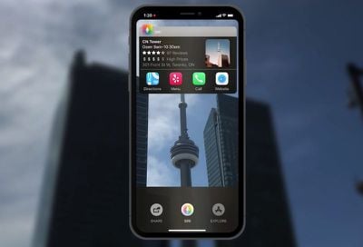
siri sight 4
Calcada's concept envisions several changes and additions to iOS, including an all-new "Siri Sight" augmented reality mode with overlays of useful information on stores, restaurants, transit stops, landmarks, and other points of interest, in addition to timely information such as road closures.

"As I believe augmented reality is a technology that will be fundamental to the future of digital interaction, I integrated AR into the core of the iOS experience, providing new innovative and intuitive ways to interact with your digital and physical worlds at once," said Calcada, who shared his video with MacRumors.


Calcada's concept also envisions grouped notifications, a notification dot in the status bar, more granular controls in the default Camera app, a systemwide dark mode, FaceTime group chats, improved volume controls, and a general makeover to iOS that has some promise, even if it is not entirely realistic.

siri sight 2
Any improvements to Siri would be welcomed, as multiple reports have suggested that Apple's assistant has fallen behind its rivals, including Amazon Alexa and Google Assistant. A recent survey also found early adopters of the iPhone X to be impressed with all of the device's major features, except Siri.

In terms of the expanded augmented reality capabilities, they could be be better suited for iOS 13, as rumors suggest Apple will release at least one iPhone with a triple-lens rear camera system in 2019. The triple-lens array would reportedly enable both expanded zoom and 3D sensing for augmented reality.
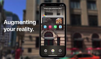
siri sight 3
As with most concepts, this one is unlikely to look like Apple's actual version of iOS 12. But with only a week remaining until the WWDC keynote, which MacRumors will be attending, it's fun to look at fan-made mockups.

Stay tuned to MacRumors for live, on-scene coverage of the WWDC 2018 keynote on Monday, June 4, beginning around 8:30 a.m. Pacific Time.

Related Forum: iOS 12

Top Rated Comments

nfl46 Avatar
95 months ago
He should have saved that concept for iOS 13 because we know damn well Apple won’t implement that many changes in iOS 12.
Score: 7 Votes (Like | Disagree)
QuarterSwede Avatar
95 months ago
Hopefully Apple put this much thought into iOS12. Because iOS11 (especially on iPhone X) seemed like an afterthought.
iOS 11 was geared heavily to the iPad where it brought a lot of advancements.
Score: 6 Votes (Like | Disagree)
jonblatho Avatar
95 months ago
Some of the ideas aren’t too bad. But it looks absolutely atrocious and some of the execution is just awful. Here’s a list of errors/questionable choices I was able to pick out:

* “The world’s most advanced operating system finally caught up.” So is it the most advanced or not? “Caught up” implies it’s even.
* The skew animation at 0:11 looks beyond fake. You don’t want static items on-screen in a video usually, but it’d have been better off here.
* Magic additional bezels appear at 0:13.
* What’s up with the lock screen? Did we forget what padding is?
* The padlock at 0:16 is unlocked but the text at the bottom says “Swipe up to unlock.”
* The high and low temperatures in the weather widget to the left of the clock are next to unreadable even after we’re zoomed in closer to the phone.
* Why should I have to tap a button to expand my notifications out of the “Notification Hub”?
* What do we really get out of having notifications sent when an iMessage contact is typing? Snapchat does this (unreliably, I might add), and it’s obnoxious.
* Letter spacing is different between the two Messages notifications at 0:28.
* New gestures. What does swiping up from the center do that swiping up from the left or right bottom corners can’t? Are they combined into one? If so, why?
* How are these new gestures communicated to the user?
* Why is there a battery percentage icon right next to the battery in the status bar?
* Why on Earth are the clock/weather/battery widgets arranged differently depending on which gesture is used?
* No chance the camera would be in use constantly on the lock screen. It’d kill the battery in a heartbeat.
* This matrix of controls at the bottom of the camera app is atrociously organized and, for most users, wildly unnecessary.
* “Verticle” home screen? I get that not everyone’s a great speller, but this video was published with that mistake?
* iOS isn’t going to allow users to change the app icon shape for myriad reasons, but if that did happen, why require users to enable it to get the slider? Why not just have the slider snap to the default?
* What are the status bar customization options that also won’t happen? They’re never shown.
* The waveform in Apple Music is hilariously bad. One of the core concepts in Apple’s HIG is deference, and that is not deferent. It draws my eyes away from the main content of the screen.
* Dark mode looks…not that different from not-dark mode in the system UI except for the apps shown.

Yet some of the people complimenting this have almost certainly complained at some point about Apple not paying enough attention to detail in QC. Goodness.
Score: 5 Votes (Like | Disagree)
SoApple Avatar
95 months ago
Some of the ideas aren’t too bad. But it looks absolutely atrocious and some of the execution is just awful. Here’s a list of errors/questionable choices I was able to pick out:

* “The world’s most advanced operating system finally caught up.” So is it the most advanced or not? “Caught up” implies it’s even.
* The skew animation at 0:11 looks beyond fake. You don’t want static items on-screen in a video usually, but it’d have been better off here.
* Magic additional bezels appear at 0:13.
* What’s up with the lock screen? Did we forget what padding is?
* The padlock at 0:16 is unlocked but the text at the bottom says “Swipe up to unlock.”
* The high and low temperatures in the weather widget to the left of the clock are next to unreadable even after we’re zoomed in closer to the phone.
* Why should I have to tap a button to expand my notifications out of the “Notification Hub”?
* What do we really get out of having notifications sent when an iMessage contact is typing? Snapchat does this (unreliably, I might add), and it’s obnoxious.
* Letter spacing is different between the two Messages notifications at 0:28.
* New gestures. What does swiping up from the center do that swiping up from the left or right bottom corners can’t? Are they combined into one? If so, why?
* How are these new gestures communicated to the user?
* Why is there a battery percentage icon right next to the battery in the status bar?
* Why on Earth are the clock/weather/battery widgets arranged differently depending on which gesture is used?
* No chance the camera would be in use constantly on the lock screen. It’d kill the battery in a heartbeat.
* This matrix of controls at the bottom of the camera app is atrociously organized and, for most users, wildly unnecessary.
* “Verticle” home screen? I get that not everyone’s a great speller, but this video was published with that mistake?
* iOS isn’t going to allow users to change the app icon shape for myriad reasons, but if that did happen, why require users to enable it to get the slider? Why not just have the slider snap to the default?
* What are the status bar customization options that also won’t happen? They’re never shown.
* The waveform in Apple Music is hilariously bad. One of the core concepts in Apple’s HIG is deference, and that is not deferent. It draws my eyes away from the main content of the screen.
* Dark mode looks…not that different from not-dark mode in the system UI except for the apps shown.

Yet some of the people complimenting this have almost certainly complained at some point about Apple not paying enough attention to detail in QC. Goodness.
It’s just a concept... and while it does has some flaws, It doesn’t merit the nit pickiness in your post.

The overall design change is very nice. Complaining about a specific gesture being used and widgets rearranged is ridiculous.
Score: 2 Votes (Like | Disagree)
ppdix Avatar
95 months ago
Awesome!!!
[doublepost=1527544493][/doublepost]Dude, what is wrong with You? It is an imagined concept. If you think you can point out so many "errors" why don't you do something better?:rolleyes:
Score: 2 Votes (Like | Disagree)
Ellis.adam Avatar
95 months ago
I think this is the best rendition I have seen. It takes what everyone has been asking about for years and also adds more. Plus it looks great without changing too much.
Score: 2 Votes (Like | Disagree)

Popular Stories

iPhone 17 Pro Iridescent Feature 2

iPhone 17 Pro Clear Case Leak Reveals Three Key Changes

Sunday August 31, 2025 1:26 pm PDT by
Apple is expected to unveil the iPhone 17 series on Tuesday, September 9, and last-minute rumors about the devices continue to surface. The latest info comes from a leaker known as Majin Bu, who has shared alleged images of Apple's Clear Case for the iPhone 17 Pro and Pro Max, or at least replicas. Image Credit: @MajinBuOfficial The images show three alleged changes compared to Apple's iP...
iPhone 17 Pro Dark Blue and Orange

iPhone 17 Release Date, Pre-Orders, and What to Expect

Thursday August 28, 2025 4:08 am PDT by
An iPhone 17 announcement is a dead cert for September 2025 – Apple has already sent out invites for an "Awe dropping" event on Tuesday, September 9 at the Apple Park campus in Cupertino, California. The timing follows Apple's trend of introducing new iPhone models annually in the fall. At the event, Apple is expected to unveil its new-generation iPhone 17, an all-new ultra-thin iPhone 17...
iphone 16 pro ghost hand

iPhone 17 Pro: 5 Reasons Not to Upgrade This Year

Monday September 1, 2025 4:35 am PDT by
Apple will launch its new iPhone 17 series this month, and the iPhone 17 Pro models are expected to get a new design for the rear casing and the camera area. But more significant changes to the lineup are not expected until next year, when the iPhone 18 models arrive. If you're thinking of trading in your iPhone for this year's latest, consider the following features rumored to be coming to...
xiaomi apple ad india

Apple and Samsung Push Back Against Xiaomi's Bold India Ads

Friday August 29, 2025 4:54 am PDT by
Apple and Samsung have reportedly issued cease-and-desist notices to Xiaomi in India for an ad campaign that directly compares the rivals' devices to Xiaomi's products. The two companies have threatened the Chinese vendor with legal action, calling the ads "disparaging." Ads have appeared in local print media and on social media that take pot shots at the competitors' premium offerings. One...
iOS 18 on iPhone Arrow Down

Apple Preparing iOS 18.7 for iPhones as iOS 26 Release Date Nears

Sunday August 31, 2025 4:35 pm PDT by
Apple is preparing to release iOS 18.7 for compatible iPhone models, according to evidence of the update in the MacRumors visitor logs. We expect iOS 18.7 to be released in September, alongside iOS 26. The update will likely include fixes for security vulnerabilities, but little else. iOS 18.7 will be one of the final updates ever released for the iPhone XS, iPhone XS Max, and iPhone XR,...
iPhone eSIM Feature

Apple Hints at iPhone 17 Models Lacking SIM Card Slot in More Countries

Sunday August 31, 2025 8:52 am PDT by
Another hint has surfaced that Apple is preparing to eliminate the physical SIM card tray from iPhones in more countries this year. In particular, a source familiar with the matter has informed MacRumors that retail employees at Apple Authorized Resellers in the EU are required to complete a training course related to iPhones with eSIM support by Friday, September 5. There are 27 countries...