All the Design Changes Rumored for iOS 19 So Far

Apple is going to unveil iOS 19 in just about two months at its June WWDC event, and rumors suggest that it's going to bring a big change to the iPhone's design. It's been described as the most notable design overhaul since iOS 7, so it should be an exciting update.

iOS 19 visionOS UI Elements
We've rounded up everything we've heard so far about the design changes coming to iOS 19.

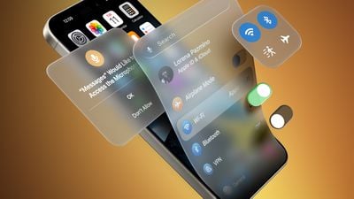
  • visionOS-like design with translucency - iOS 19 is inspired by visionOS, which has an emphasis on translucency and UI elements that kind of fade into the background to put the focus on content. iOS 19 could lean heavily into that translucency, with Apple also opting for a floating look for navigation bars, windows, and other parts of the UI.
  • A glassier look - Remember the Aqua Mac interface? iOS 19 has been described as having glass effects or as being glossy, with menu elements that can "reflect" light based on ‌iPhone‌ tilt.
  • Subtle lighting effects - The "glassy" look involves subtle lighting changes, such as a slight glint for some UI elements when you move the ‌iPhone‌. The Flashlight and Camera controls on the Lock Screen reportedly have a glass-like sheen that shimmers with movement, for example.
  • More rounded, expanding buttons - Along with a soft, floating look, navigation bars and buttons could have more rounded edges that blend better with the content behind them. In the Photos app, for example, photos could be full screen with controls in a slimmed down menu bar at the bottom rather than a full navigation strip. Haptic Touch menus, Control Center options, and permission prompts apparently have more rounded corners, too.
  • Pill-shaped tab bars - Many apps like the App Store, Apple Music, Apple TV, ‌Photos‌, Phone, and more have been described as having pill-shaped tab bars at the bottom for accessing controls. There's also less transitioning. Search, for example, doesn't have its own dedicated interface, and instead expands out from the tab bar.
  • Round app icons, maybe - Leaker Jon Prosser says that Apple is going to make the ‌iPhone‌'s icons rounder, though he is unclear if they will be entirely circular or some kind of cross between a circle and the current squircle.
  • Simplified navigation and controls - Apple wants to make it easier to navigate through apps, System settings, and more, so expect a more streamlined experience.
  • Cross-platform cohesiveness - These design changes aren't just coming to iOS - iPadOS and macOS will also get the same overhauled look, so it will be less jarring going from a Mac to an ‌iPhone‌ and vice versa.

Read More

We're keeping track of the iOS 19 rumors in our dedicated iOS 19 roundup, which also has details on Apple Intelligence features, new app capabilities, compatibility, and more.

Popular Stories

iPhone 17 Pro Dark Blue and Orange

iPhone 17 Release Date, Pre-Orders, and What to Expect

Thursday August 28, 2025 4:08 am PDT by
An iPhone 17 announcement is a dead cert for September 2025 – Apple has already sent out invites for an "Awe dropping" event on Tuesday, September 9 at the Apple Park campus in Cupertino, California. The timing follows Apple's trend of introducing new iPhone models annually in the fall. At the event, Apple is expected to unveil its new-generation iPhone 17, an all-new ultra-thin iPhone 17...
xiaomi apple ad india

Apple and Samsung Push Back Against Xiaomi's Bold India Ads

Friday August 29, 2025 4:54 am PDT by
Apple and Samsung have reportedly issued cease-and-desist notices to Xiaomi in India for an ad campaign that directly compares the rivals' devices to Xiaomi's products. The two companies have threatened the Chinese vendor with legal action, calling the ads "disparaging." Ads have appeared in local print media and on social media that take pot shots at the competitors' premium offerings. One...
maxresdefault

The MacRumors Show: iPhone 17's 'Awe Dropping' Accessories

Friday August 29, 2025 8:12 am PDT by
Following the announcement of Apple's upcoming "Awe dropping" event, on this week's episode of The MacRumors Show we talk through all of the new accessories rumored to debut alongside the iPhone 17 lineup. Subscribe to The MacRumors Show YouTube channel for more videos We take a closer look at Apple's invite for "Awe dropping;" the design could hint at the iPhone 17's new thermal system with ...
iPhone 17 Pro Iridescent Feature 2

iPhone 17 Pro Clear Case Leak Reveals Three Key Changes

Sunday August 31, 2025 1:26 pm PDT by
Apple is expected to unveil the iPhone 17 series on Tuesday, September 9, and last-minute rumors about the devices continue to surface. The latest info comes from a leaker known as Majin Bu, who has shared alleged images of Apple's Clear Case for the iPhone 17 Pro and Pro Max, or at least replicas. Image Credit: @MajinBuOfficial The images show three alleged changes compared to Apple's iP...

Top Rated Comments

Reason077 Avatar
21 weeks ago
visionOS has good reasons for it’s translucent UI elements and glass pane effects.

But in a phone UI, elegant simplicity really is better than flashy effects. Shiny glass UI elements may be pretty, but they distract from content. Go too far and they become garish.

Let’s hope Apple keeps things simple and subtle!
Score: 10 Votes (Like | Disagree)
Kylo83 Avatar
21 weeks ago
what about actual new features. and this is just a paint job, where as mark said its more than just a paint job
Score: 6 Votes (Like | Disagree)
0049190 Avatar
21 weeks ago
From what I’ve read so far I don’t see any signs of a major design overhaul. I hope the keynote in June will reveal a lot more interesting changes.
Score: 5 Votes (Like | Disagree)
StellarVixen Avatar
21 weeks ago
IMHO, a welcome departure from the boring, flat and unintuitive design that has overstayed its welcome (if it was ever welcome, I’ve been waiting almost 15 years for it to go away).
Score: 4 Votes (Like | Disagree)
arthurgd3 Avatar
21 weeks ago

visionOS has good reasons for it’s translucent UI elements and glass pane effects, but iOS can’t say the same.

Elegant simplicity really is better than flashy effects when it comes to UI elements. Let’s hope Apple keeps things simple and subtle!
The line between form and function is always a fine one and a lot can be subjective as to what is the better route to take but I'm also someone that gets tired of the same design for too long regardless of how much I may have liked it or have found value in it when it was introduced so I'm all for this revised look until this too gets to the point of stagnant.
Score: 3 Votes (Like | Disagree)
niseilat Avatar
21 weeks ago
The Home Screen is going to be paginated vertically instead of horizontally
Score: 3 Votes (Like | Disagree)