In the initial macOS Tahoe beta, Apple swapped the colors of the Finder icon, a longtime Mac classic. Rather than featuring blue on the left side of the face and light blue on the right side, the icon was primarily white and the right side of the face was blue.
macOS Tahoe Finder icon in beta 2
The updated Finder look was a significant deviation from the design that Apple has used for Finder since 1996, and many Mac users were unhappy with the change. Apple had tweaked the Finder colors and design slightly over the years, but the first Tahoe beta marked the first significant change that we've seen because of the decision to put the darker color on the right.
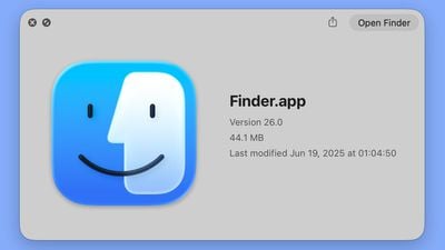
Apple has now reverted the Finder icon to a more traditional color scheme, while keeping the Liquid Glass look. The left side of the face is blue, while the lighter side is a white/blue gradient that has a layered, glass-like appearance.
macOS Tahoe Finder icon in beta 1
The icon isn't the same as the version in macOS Sequoia because it doesn't use an even color split, but it's much closer to the original design while still looking fresh.
Thursday August 28, 2025 4:08 am PDT by Tim Hardwick
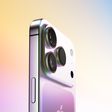
An iPhone 17 announcement is a dead cert for September 2025 – Apple has already sent out invites for an "Awe dropping" event on Tuesday, September 9 at the Apple Park campus in Cupertino, California. The timing follows Apple's trend of introducing new iPhone models annually in the fall.
At the event, Apple is expected to unveil its new-generation iPhone 17, an all-new ultra-thin iPhone 17...
Friday August 29, 2025 4:54 am PDT by Tim Hardwick
Apple and Samsung have reportedly issued cease-and-desist notices to Xiaomi in India for an ad campaign that directly compares the rivals' devices to Xiaomi's products. The two companies have threatened the Chinese vendor with legal action, calling the ads "disparaging."
Ads have appeared in local print media and on social media that take pot shots at the competitors' premium offerings. One...
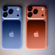
Apple's cases for the iPhone 17 lineup will be accompanied by a new Crossbody Strap accessory with a unique magnetic design, according to the leaker known as "Majin Bu."
Apple's Crossbody Strap reportedly features an unusual magnetic design; it likely has a "flexible metal core" that makes it magnetic along its entire length. At the ends, "rings polarized oppositely to the strap close the...
Tuesday August 26, 2025 4:17 pm PDT by Juli Clover
Apple today announced its "Awe Dropping" iPhone-centric event, which is set to take place on Tuesday, September 9 at 10:00 a.m. Pacific Time. There are a long list of products that are coming, but we thought we'd pull out five feature highlights to look forward to.
That Super Thin iPhone - Apple's September 9 event will see the unveiling of the first redesigned iPhone we've had in years, ...
The new Finder icon did appear strikingly different, and not better. I'm glad they reverted this.
The Finder icon has always been an odd duck, and I'm glad they are retaining it at all, since they could change it to a boring Home icon, in the name of consistency.
The new Finder icon did appear strikingly different, and not better. I'm glad they reverted this.
The Finder icon has always been an odd duck, and I'm glad they are retaining it at all, since they could change it to a boring Home icon, in the name of consistency.
Yeah, I'm honestly surprised they've kept the icon for this long. While I like it, it doesn't really make "sense" in the way the other icons do. It certainly doesn't say anything about file management. But there's something about that familiar smiling face that makes using the Mac a little more pleasant and human. I'm glad they've kept it.
Rather than featuring blue on the left side of the face and light blue on the right side, the icon was primarily white and the right side of the face was blue.
Did this change really need a whole article? I didn’t see a problem with inverting the colors in Beta 1
Yeah people were pretty mad. And understandably so, the icon has been instantly recognizable for like 40 years and there was no reasonable justification for inverting the colors.
Biggest design overhaul since iOS 7 with Liquid Glass, plus new Apple Intelligence features and improvements to Messages, Phone, Safari, Shortcuts, and more. Developer beta available now ahead of public beta in July.
 macOS Tahoe Finder icon in beta 2
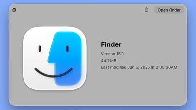 macOS Tahoe Finder icon in beta 1