iOS 26 Liquid Glass Design Drama: Beta 2 vs. Beta 3 Changes in Every App

Apple has been refining Liquid Glass during the developer beta testing process, and both beta two and beta three have introduced some major tweaks. There was little outcry over the updates that Apple made in the second beta, but the third beta's design updates have frustrated some users who feel that Apple is removing too much of the Liquid Glass aesthetic.

iOS 26 Beta 2 vs Beta 3 Dawn of Justice
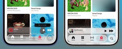
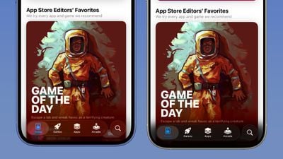
For context, Apple made navigation bars more opaque across many apps in iOS 26 beta 3, and we've got a series of side-by-side comparisons that demonstrate what's different. In all of the comparison images, beta 2 is on the left and beta 3 is on the right.

Apple Music

Apple Music's bottom navigation bar is more opaque, and it has the frosted glass look that Apple is now favoring. The change is most noticeable when scrolling over a background that has color. In beta 2, the navigation bar was almost translucent, allowing much of the background color to shine through. That effect is significantly reduced in beta 3.
ios 26 nav bar transparency beta 3

apple music dark mode ios 26 beta 3

Safari

The changes in Safari vary depending on what you're doing, the background color of the website, and which Tab View design you're using. In general, the URL bar is more opaque and less prone to notable shifts in color. Less of the background comes through.

safari ios 26 beta 3
The URL bar will still change from light to dark if the content you're scrolling over is predominantly dark, but there's a higher threshold for that to kick on.

safari bottom tab ios 26 beta 3
It's easiest to see the difference with the Compact View, because it was the most translucent view to begin with.

App Store

The App Store's navigation bar has one of the most noticeable changes, and it's almost entirely opaque now.
ios 26 beta 3 app storeLight Mode

Podcasts

As with ‌Apple Music‌, translucency has been almost entirely eliminated in the Podcasts navigation bar. The change is easiest to see with backgrounds that have color.

ios 26 beta 3 podcasts

Apple TV

The Apple TV app has a darker background and the change is more subtle. The overlaying navigation bar is a darker glass color, but transparency appears to be similar.

apple tv app ios 26 beta 3

Photos

For the Photos app, Apple tweaked the design in a similar way to the ‌Apple TV‌ app. The navigation bar is darker, but there's been little change to transparency.

photos appios 26 beta 3

Calendar

Calendar's navigation buttons are more opaque, both in Light Mode and ‌Dark Mode‌.

ios 26 beta 3 calendar

Keyboard

The Spotlight Search keyboard is both more and less translucent. The keyboard itself has slightly more background visible, but the search bar is darker.

keyboard ios 26 beta 3

Dark Mode

‌Dark Mode‌ has retained more transparency than Light Mode for the most part, so you may see less of a difference if you have ‌Dark Mode‌ enabled permanently. Some menu bar elements are darker than before, but white text on a dark background is more readable so Apple had to increase the opaqueness less.

safari dark mode ios 26 beta 3
This isn't true for all apps, though, and there are areas with dark navigation bars that also have less translucency.

Color Dependency

The difference that you see between beta 2 and beta 3 can vary quite a bit depending on the color in the background. With some white backgrounds, it's hard to tell that the Liquid Glass has a more frosted appearance, and the updates are mostly noticeable with light colors.

ios 26 beta 3 apple news
Over content that is are darker, navigation bars will often transition to their ‌Dark Mode‌ view that appears more translucent, as can be seen in the Safari screenshot below. This is the same effect you'll see with ‌Dark Mode‌ enabled.

safari dark ios 26 beta 3

Notifications, Lock Screen, and Home Screen

On the Lock Screen, the time is ever so slightly more opaque than it was before. With some background colors, notifications also have a darker background than before, but this isn't always noticeable. Home Screen and Control Center haven't changed much if at all.

ios 26 b2 b3 comparison

For App Library, the search bar doesn't have blurred edges when scrolling, which makes it easier to see. Apple hasn't changed translucency.

app library ios 26 beta 3

Other App Changes

Most of Apple's built-in apps have tweaked buttons and navigation bars in ‌iOS 26‌ beta 3, with repeats of the design changes listed above.

  • Weather - The buttons at the bottom of the app are much darker than before, and the search button is no longer translucent.
  • Camera - No noticeable change.
  • FaceTime - No noticeable change.
  • Messages - The search bar isn't as translucent, nor is the message compose bar. Popover buttons haven't changed.
  • Maps - Maps is actually more translucent, because it's using Liquid Glass for the turn-by-turn directions that are shown at the top of the app.
  • Mail - Buttons have less translucency.
  • Notes - The buttons and navigation bar in the Notes app already had little translucency, but it's been reduced further and is almost non-existent.
  • Reminders - When you're composing a Reminder, the toolbar has less translucency. The search bar and popover menus are the same.
  • Clock - No change.
  • Health - The Health app's navigation bar and search bar are a little less transparent, but it was already fairly opaque.
  • Wallet - Buttons aren't as transparent, so if you scroll over something with bright colors, it's no longer visible behind the button.
  • Settings - The Search bar is more opaque.
  • Find My - No change.
  • Stocks - The translucency of Top Stories is unchanged, but the search bar has increased opacity.
  • Home - Less opacity overall for navigation bar and home control buttons.
  • Books - Navigation menus and search have less translucency.
  • Fitness - Little change because the app uses a darker background, but the buttons are a touch darker than before.
  • Contacts - Less translucency for search.
  • Files - Less translucency for navigation bar and search.
  • Translate - No change.
  • Shortcuts - Less translucency for navigation bar. Keyboard translucency remains the same.
  • Calculator - History interface is more opaque.
  • Voice Memos - No change.
  • Compass - No change.
  • Passwords - Navigation bar and search interface lost translucency.
  • Games - Navigation bar is darker and less translucent.
  • Preview - No change.

What do you think of the changes that Apple made in ‌iOS 26‌ beta 3? Are you hoping for some of the Liquid Glass design to be reimplemented, or do you prefer the more opaque look? Let us know in the comments below.

Related Roundups: iOS 26, iPadOS 26
Related Forum: iOS 26

Popular Stories

iPhone 17 Pro 3 4ths Perspective Aluminum Camera Module 1

New iPhone 17 Pro Details: Brighter Display, Best Battery Life, and More

Wednesday September 3, 2025 5:33 am PDT by
Apple's iPhone 17 Pro and iPhone 17 Pro Max models will feature a number of significant display, thermal, and battery improvements, according to new late-stage rumors. According to the Weibo leaker known as "Instant Digital," the iPhone 17 Pro models will feature displays with higher brightness, making it more suitable for use in direct sunlight for prolonged periods. The iPhone 16 Pro and...
iPhone 17 Pro Iridescent Feature 2

iPhone 17 Pro Clear Case Leak Reveals Three Key Changes

Sunday August 31, 2025 1:26 pm PDT by
Apple is expected to unveil the iPhone 17 series on Tuesday, September 9, and last-minute rumors about the devices continue to surface. The latest info comes from a leaker known as Majin Bu, who has shared alleged images of Apple's Clear Case for the iPhone 17 Pro and Pro Max, or at least replicas. Image Credit: @MajinBuOfficial The images show three alleged changes compared to Apple's iP...
iphone 16 pro ghost hand

iPhone 17 Pro: 5 Reasons Not to Upgrade This Year

Monday September 1, 2025 4:35 am PDT by
Apple will launch its new iPhone 17 series this month, and the iPhone 17 Pro models are expected to get a new design for the rear casing and the camera area. But more significant changes to the lineup are not expected until next year, when the iPhone 18 models arrive. If you're thinking of trading in your iPhone for this year's latest, consider the following features rumored to be coming to...
iPhone 17 Pro Iridescent Feature 2

iPhone 17 and iPhone 17 Pro Prices Estimated Ahead of Apple Event Next Week

Tuesday September 2, 2025 1:50 pm PDT by
Just one week before Apple is expected to unveil the iPhone 17 series, an analyst has shared new price estimates for the devices. Here are J.P. Morgan analyst Samik Chatterjee's price estimates for the iPhone 17 series in the United States, according to 9to5Mac: Model Starting Price Model Starting Price Change iPhone 16 $799 iPhone 17 ...
iPhone 17 Pro Dark Blue and Orange

iPhone 17 Release Date, Pre-Orders, and What to Expect

Thursday August 28, 2025 4:08 am PDT by
An iPhone 17 announcement is a dead cert for September 2025 – Apple has already sent out invites for an "Awe dropping" event on Tuesday, September 9 at the Apple Park campus in Cupertino, California. The timing follows Apple's trend of introducing new iPhone models annually in the fall. At the event, Apple is expected to unveil its new-generation iPhone 17, an all-new ultra-thin iPhone 17...
iOS 18 on iPhone Arrow Down

Apple Preparing iOS 18.7 for iPhones as iOS 26 Release Date Nears

Sunday August 31, 2025 4:35 pm PDT by
Apple is preparing to release iOS 18.7 for compatible iPhone models, according to evidence of the update in the MacRumors visitor logs. We expect iOS 18.7 to be released in September, alongside iOS 26. The update will likely include fixes for security vulnerabilities, but little else. iOS 18.7 will be one of the final updates ever released for the iPhone XS, iPhone XS Max, and iPhone XR,...
iPhone 17 Pro on Desk Centered 1

Survey: Nearly 70% of Users Plan to Upgrade to iPhone 17

Monday September 1, 2025 8:24 am PDT by
A new survey has found that nearly seven in ten iPhone owners in the United States plan to upgrade to an iPhone 17 model, signaling strong demand ahead of Apple's expected unveiling of the devices at its September 9 keynote. Smartphone price comparison platform SellCell surveyed over 2,000 U.S.-based iPhone users in August to assess upgrade interest and brand loyalty before Apple's event....

Top Rated Comments

GrassShark Avatar
8 weeks ago
Call me crazy but I think being able to read basic UI copy is a good thing.
Score: 82 Votes (Like | Disagree)
slb Avatar
8 weeks ago
We all knew this would happen. All that blurry translucency was illegible.
Score: 55 Votes (Like | Disagree)
UncleGuido Avatar
8 weeks ago
Please, Apple, just make sure that there is a switch in Accessibility that lets me turn off this useless eye candy. I want UI elements that are contrasty and easy to read, regardless of what is behind them. In the WWDC keynote, Federighi bragged about how this new design "blurs the lines between software and hardware." He should have stopped at "blurs the lines."
Score: 50 Votes (Like | Disagree)
zobby Avatar
8 weeks ago
Is this really as good as it gets? Lifelong iPhone user and feeling distinctly underwhelmed.
Score: 39 Votes (Like | Disagree)
JaylenFast Avatar
8 weeks ago
For what it's worth I am in the design industry, and I am just flabbergasted at how the original state of Liquid Glass was passed and presented to millions of people, and ONLY NOW they see issues and make drastic changes. It doesn't take user feedback to realize it's legibility flaws.

It now leads me to believe that this entire iOS redesign was rushed and half-baked, and that animations were the priority. For a large company this is not the feeling I should have about their design process. They should want to be known for careful planning and innovation... scary times for Apple.
Score: 27 Votes (Like | Disagree)
piccolamela Avatar
8 weeks ago
liquid glass to dirty or foggy glass...

wonder how much of the design will be still around, once iPadOS 26 and IOS 26 are released.

What has gone wrong in testing and when it was green lighted that they did notice the overall readability and legibility as a big issue?

I'm ambivalent on this change, not fond of either the old nor the new design in particular. It was meh, it is meh, but as long as it's consistent and not outright user hostile it will do.
Score: 22 Votes (Like | Disagree)